Sunstone Advisory
Canberra-based consultancy, Sunstone, are a team of highly skilled specialists delivering advisory services, technical consulting and ICT solutions. Enabling government and defence teams to make informed, evidence-based decisions about Australia’s future.
Client sector
Professional services | Government
Project scope
Brand strategy
Brand identity
Print collateral
Digital marketing
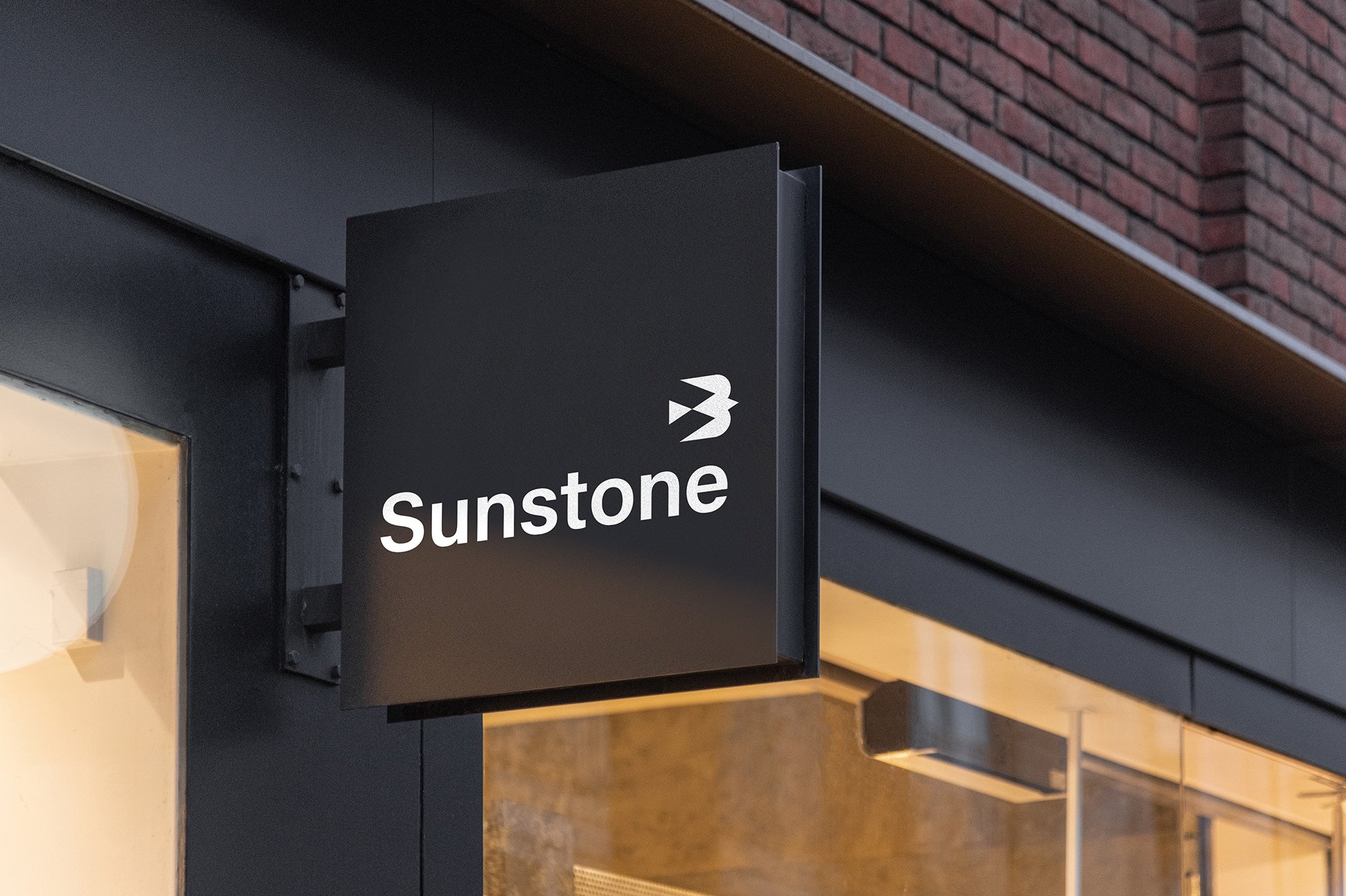
Signage
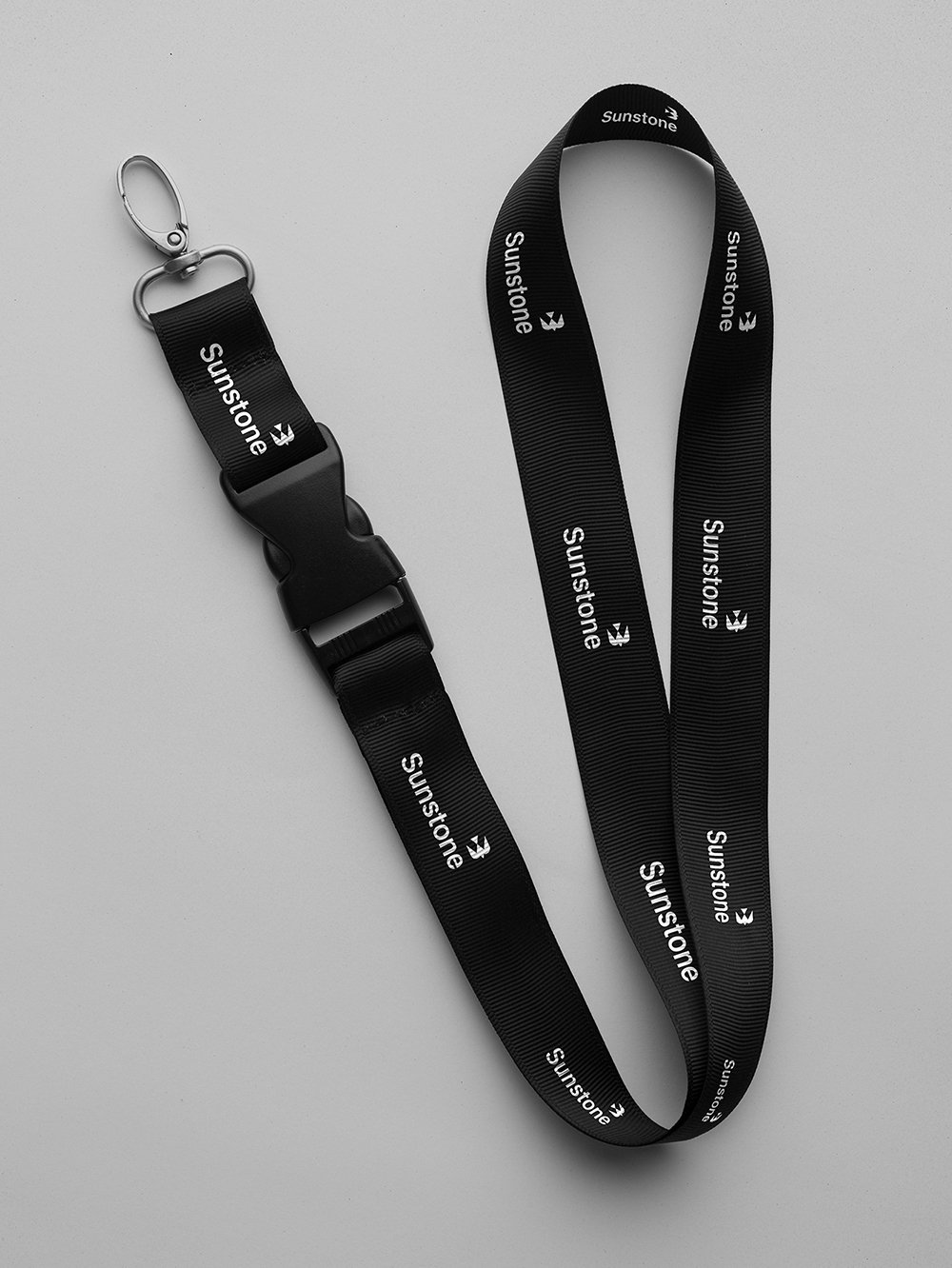
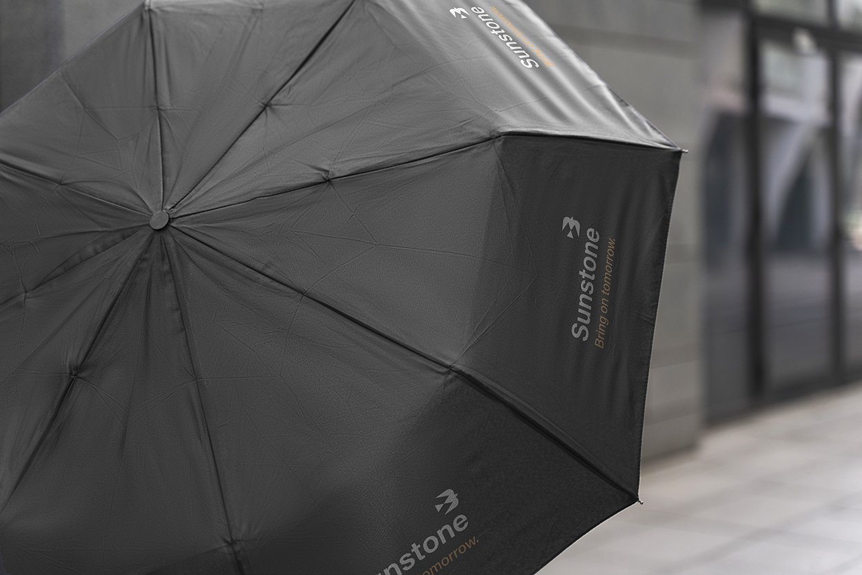
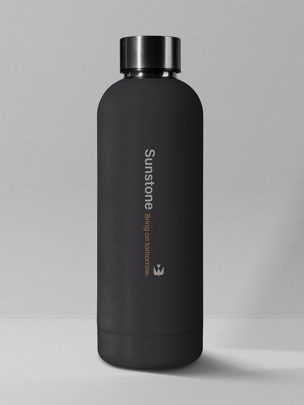
Merchandise
Project overview
To realise their strategic plans and fulfil their challenger brand potential, defence and ICT specialists ‘Connect’ (as they were previously known) needed a more polished look and some well-chosen words.
Although only a few years old, the consultancy had already outgrown their visual identity and needed a smarter way to tell their ever-evolving brand story. And, as it turns out, they needed a new name too.


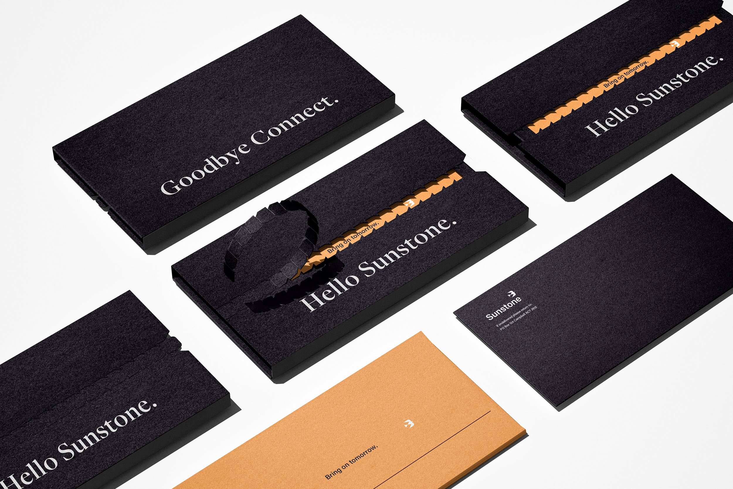
From Connect to Sunstone. Rebranding a government consultancy.
Originally chosen by the founders for its people-centric meaning the existing name, ‘Connect’, didn’t feel right for where the business was headed. Simplistic and a bit cliche, it lacked sophistication. So, after research and a naming workshop, a new one was selected: Sunstone.
-
Initially favouring a more literal name (like Connect), after much discussion the founders chose Sunstone. A more tonally apt and conceptual name.
Mined in Australia, sunstones are synonymous with fairness, support, leadership, empowerment and action. All fitting attributes for the brand’s strategic direction.
Although not everyone will be familiar with these associations, it’s nice to have a bit of story and meaning to a name.
The two component words of the name (‘sun’ and ‘stone’) break down to represent the two sides of the brand’s story: clarity and certainty, positivity and pragmatism, illumination and assurance.


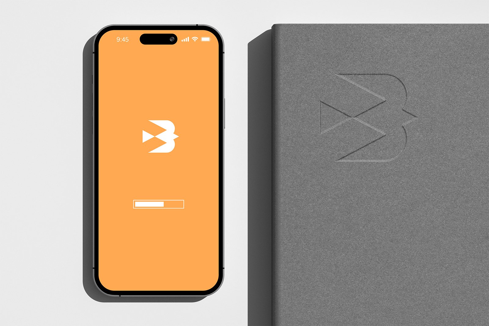
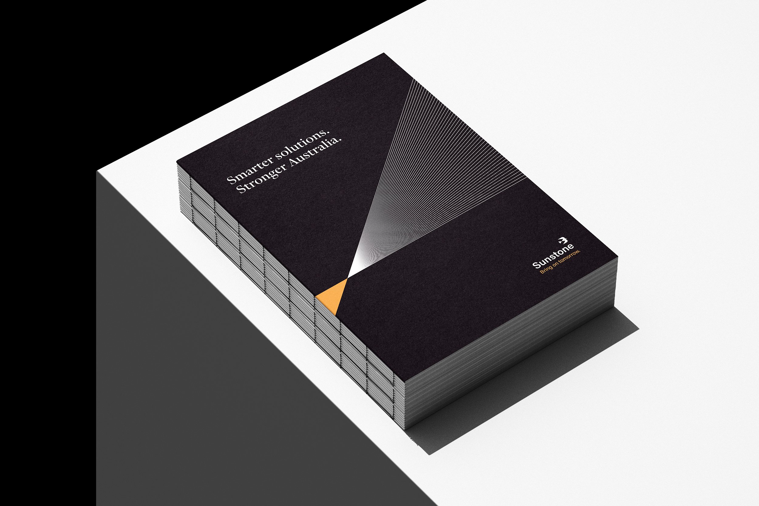
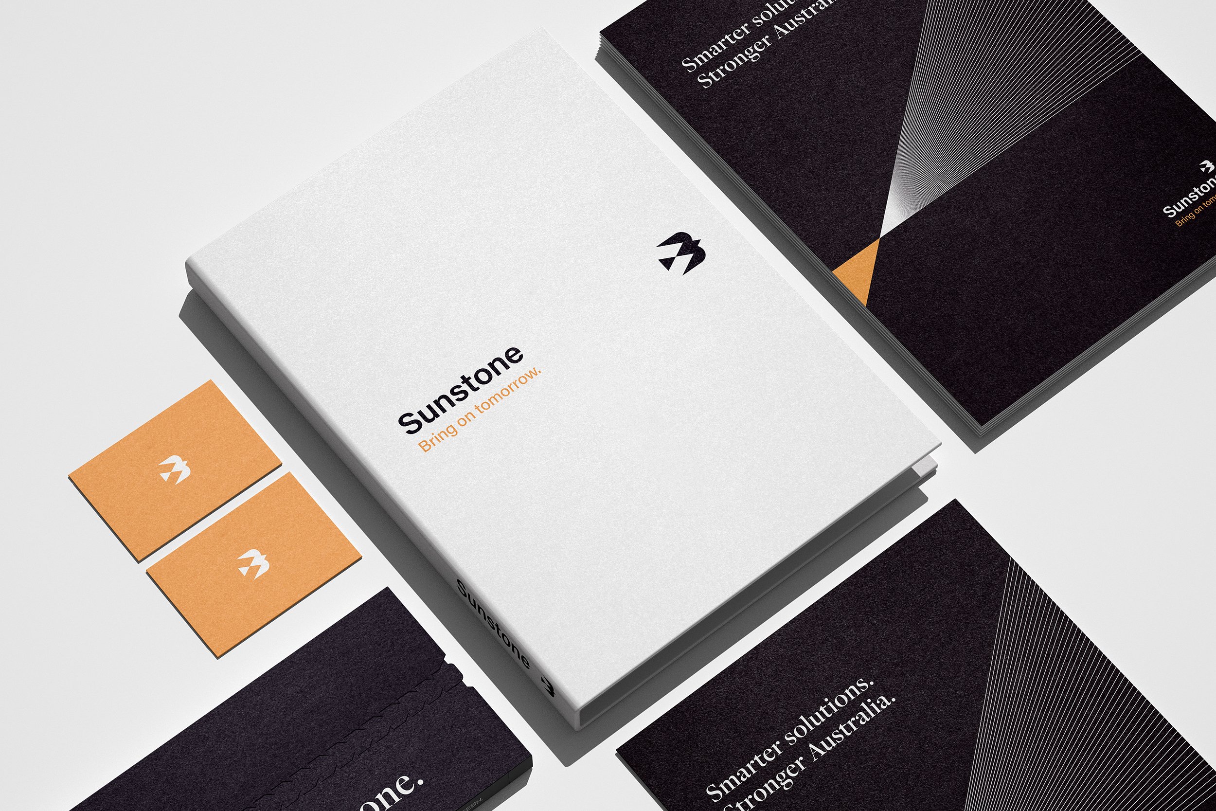
After defining a new brand blueprint, strategy and messaging, a new visual identity was crafted to reflect the new brand personality. Delivering complex solutions and providing highly technical consulting doesn’t mean you have to look complex or technical. Instead a fresh, polished identity was created. A visual language that supports the founders vision and growth plans.
A point of difference, and avoiding the obvious.
Although the company was built around human connection’, generic ‘people consulting’ photos were avoided in preference for an image strategy that was a bit different. Featuring aerial images of the beautiful land Sunstone work to strengthen and protect: Australia.
The new visual and verbal identity has been rolled out across a host of print and digital collateral. The business is growing sustainably and the brand is going from strength to strength.